
Previously, we discussed basic data properties and ways of thinking about data. This blog will discuss dashboarding and reporting, and how you can build management by exception into your data dashboards. The purpose is to have more control over huge volumes of metrics that you’ll be collecting continuously.
Effectively managing your data will lead to improvements in insight and reliability. Thus, an increased level of trust is established with your customers and within your organization.
Estimated reading time: 3 minutes
How Management by Exception Simplifies Your Dashboard
Ideally, we always monitor outcome variables, which in most cases are counts or measures of something. For instance, it could be the number of sales, number of engagements, or the volume of clicks on a website. We want to monitor these outcome variables to see how they’re trending.
However, the challenge arises if many outcome variables need to be monitored. How do we monitor them? If you chart these metrics in a simple line chart, you will realize that there’s an ebb and flow in the data that represents a natural variation in your data. We call this distribution and the distribution follows a trend most times.
If you’re making the same entries in the same way over time, it’ll have a basic flow with natural peaks and valleys. However, if you fail to include some information or you cannot put a reporting method over those peaks and valleys to show you when things are unique, you can’t be actionable about it. The reason is you could overreact to a normal valley or overreact to a normal peak of data distribution.
It is important to be aware when something happens that’s uniquely high or low. That is where management by exception comes in. Management by exception works by using standard deviation to let you know when a metric reading goes outside its normal distribution.
(You can listen to the full episode of the podcast below.)
Standard Deviation and How it Applies in Dashboarding
There are different tiers to a normal distribution—tier 1, tier 2, and tier 3. Tier 1 is one standard deviation away from the mean, tier 2 is two standard deviations away, and tier 3 is three standard deviations away from the mean. The further you move away from the average, the more the likelihood that the reading is unique.
This gives you more control and power over how you’re looking at data. For instance, data involving foot traffic in a store, visitors to a website per day, or interactions per day is something that you’d like to keep an eye on but is not that sensitive to you. Before it’s brought to your attention, you want to be certain that something unique is happening. Therefore, you could need two or more thresholds certain before you can give it your attention.
The threshold of this statistic becomes the deciding factor of what’s important and what’s not. When you’re charting the variables, you’ll have control over your dashboard and identify what requires attention, what will be highlighted, or what will trigger an email alert. That’s the importance of dashboarding and management by exception. It indicates a problem when things are truly unique.
Final Thoughts
Using management by exception in your data dashboards allows you to use standard deviation, and overlay it on your outcome metrics to get more information and effectively report it. This will help to unlock the potential of your data and make it more valuable to your stakeholders. Thus, creating a more efficient decision-making process.
Download the Free Spreadsheet Tool
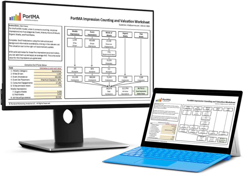
CALCULATE THE DOLLAR VALUE OF EVENT IMPRESSIONS
PortMA Impression Counting and Valuation Worksheet
Download this spreadsheet and complete the fields for your campaign to get a clear count of your activation impressions translated into a Dollar Value of Marketing
Impression Spreadsheet