One of the biggest challenges researchers face is finding a way to present results in a way that is both meaningful and easily understood by non-researchers. A popular solution to this challenge is data visualization, the method for representing data in graphic form.
Traditionally, data visualization was achieved through the use of statistical methods such as bar charts, Venn diagrams, scatter plots. In the age of information, however, these tried-and-true graphics have been replaced to some degree by a different set: slick infographics, Wordles, and digital dashboards.
It seems everyone wants in on the new techniques: Google the term, and any number of resources, tools, experts, and example images appear. Graphic designers are working with researchers to create more aesthetically pleasing reports. There are now college courses and certification programs dedicated solely to presentation design.
Some of this is counter-intuitive to the research process. While creating reports that clearly communicate the findings and implications is the primary goal, creative communication can be a challenge, especially for those of us who have “left brain” inclinations.
Recently, we put together a report that had all the ingredients for success: solid data, compelling results, meaningful insights. Like a musical crescendo, we had orchestrated and arranged the data to build up to what was the highlight of the report. But there was so much data at the beginning of our orchestration that it became dissonant instead of symphonic for the client. We had overwhelmed them with so much data, they became confused and we never made it to the main part of the deck.
We decided to go back to the drawing board. We did two things:
- We reversed the order, leading with what we knew the client team wanted to see first and sending all supporting slides to the back of the deck
- We consulted with a graphic designer, translating the methodology and executive summary from words to pictures.
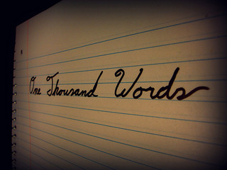
Not a single data point was changed nor any findings re-positioned. The result was a slightly different deck, but a completely different response, proving that a picture really can be worth a thousand words.
How do you know what type of data visualization to use?
If you find yourself grappling with the best way to incorporate data visualization techniques into your report, here are some of the questions we have included in our discussions about reporting strategy and planning:
- Who is your audience? What is their comfort level with research? Are they looking for details or are they looking for the bottom line?
- How will the document be used? Are you delivering a report that can be a stand-alone document, or are you delivering a presentation that you will be walking the audience through sequentially?
- Is there someone who can offer a second, informed opinion on your report?
Photo Source: https://portma.com/wp-content/uploads/2014/04/1000words.jpg